August 01, 2017
Are you concerned about Accessibility? How to educate developers on creating accessible websites
First the participants propose discussion topics and then, after voting, group discussions are created about the most popular selections: one of those was accessibility! There are also passion talks, which are 5- to 10-minute talks about something you want to share (which could be technical or non-technical). (I recommend taking a look at Jesse Beach's “What is Accessibility?” passion talk if you haven't seen one.) The registrations for Offline Camp are limited to about 30 participants, which helps everyone get to know each other and keeps discussions productive. I decided to attend the “A11Y” discussion because I barely knew anything about accessibility. Usually we don't think as much about A11Y as we should.


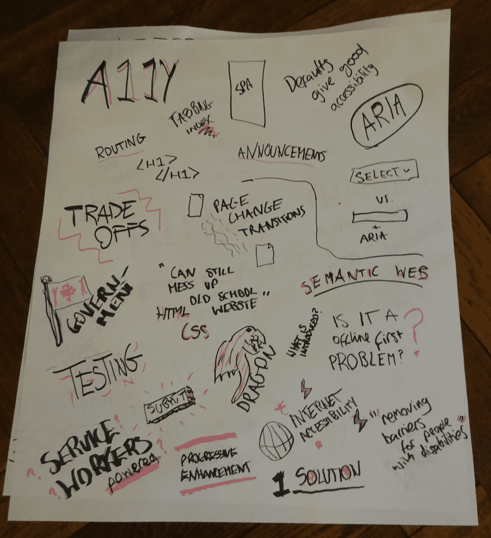
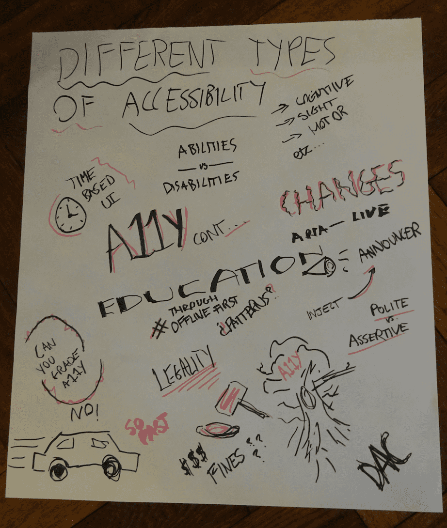
The session started with us talking about how can we relate accessibility to Offline First and how it can change people's lives. We identified different types of disability such as cognitive, vision, motor, an so on. The discussion was mainly around our concerns regarding web (the majority of the people in the room were web developers) and what we do when creating Single Page Applications (SPA).
We shared some examples and common problems, namely:
- Routing
- Semantic web (e.g. the [in]correct usage of hierarchical headings)
- Using a select box (versus an input with ARIA attributes)
- Forms
- Tricks using tabIndex
- Change transitions (e.g. animations) in the page
- Always giving feedback from actions
These issues do not help to make our web more accessible. If you're a JavaScript developer, think twice before using onMouseOver events when creating on-hover drop-down menus! These actions should be device-independent, meaning that both mouse and keyboard should be available to perform an action.
There are also some standards that must be followed and that people create expectations about. For instance, an HTML reference must link to "Contact us" and never to "You can contact us" (or similar). The latter is less intuitive and will not appear in the expected order if people ask screen readers to read alphabetically. Please take into consideration that the alphabetic ordering only applies to menus and lists of links, not links that form part of the document body. Moreover, every action should have an effect: when the user clicks on something, the page should react and feedback needs to be provided.
If you're like me, you've probably heard about ARIA attributes before. Recently I found a super interesting and enlightening blog post that has actual answers about what people with disabilities think about A11Y. This list made me feel really bad about the content we produce. It's a small step to start using ARIA correctly.
However, it's really difficult to have a website that is fully accessible because different people with different disabilities have different requirements. For example, the blog post referenced above points out that color contrast and photo backgrounds are "a major problem". Even OfflineCamp website does it.
It's quite common for me now to go to a new website and press tab key to see if they have the "Skip Navigation" link (which defaults to display: none if tab is not pressed):

This is really useful for someone who just wants to find the content, allowing them to go directly to it by ignoring the headers and other fancy stuff that we have around our websites. This is progressive enhancement at its best! If you didn't know about that, please learn more about the Skip Navigation trick. I learned a lot during and after this session. Always be curious!
One interesting highlight of our group discussion was about how to alert users to a change in the page. Imagine that your user is reading your newspaper when a really important new article appears on the website, such as a huge fire in a specific location. For a person that can see it, the new article will be visible and the person gets notified. However, for blind people we need to decide when to show that information. Should we show that instantly? Or after the current sentence being finished? Or not at all? It really depends on the priority, and the user's screen reader also has some settings for it (checkout aria-live attribute).
Our conclusion from the session was that accessibility is not specifically an Offline First problem, but is an issue we can take steps to address. We discussed how Service Workers can help by intercepting fetch requests and returning the relevant content. We also explored how some web elements such as forms can be accessible to everyone with the correct attributes and how we can make them work offline. To summarize, we believe that developers and people in general need education about A11Y and we should push and promote it, because it is not that difficult to remove some of the barriers for people with disabilities.
Pro tip: DIY!
Install an extension. Start using tab and shift + tab to navigate the web. You will find it more difficult than expected if you've never tried it. I recommend trying the NoCoffee extension for Chrome, which simulates sight issues such as blur or cloudiness:

You can also try out VoiceOver on MacOS, JAWS on Windows, or another screen reader (you may even have issues if the settings are for a particular language and the website is not defining any!). The list of problems that may arise is incredible.
Second Pro tip: Ignore the last one and test with real users!
We have all these tools available right now, but the real tests are with real users. At the camp session, Nick from the UK's Government Digital Service shared success stories about how his team invites people with disabilities to actively participate in the development process.
Some other useful links
Cool list of ARIA examples
Specs from W3C for ARIA. I found the issues quite interesting
How The Guardian is educating developers about Accessibility
UK Government Dos and don'ts on designing for accessibility, which summarizes their findings, was one of my favourite articles
Check out accessibility dev tools by Google
Awesome-A11Y has a list of resources to learn about A11Y
Pa11y has a set of tools for designers and developers to make the web more accessible
AxE quite awesome set of tools (chrome extension + various flavours of CLI and integrations)
Do you use React.js? Me too! Few days ago some people from the community published a list of standards and guidelines about accessibility.
To infinity and beyond
II left the group discussion empowered to seek out more information about accessibility and what I can do as a developer to educate and help. This was the trigger for me and I got motivated to read some articles and watch some talks about accessibility.
At the end of our session, we talked a bit on twitter about these issues. Check out that quick discussion:
Tweet: https://twitter.com/MylesBorins/status/858695075370590208
Recently a friend provoked me by sharing a tweet about Progressive Web Apps (PWAs) and A11Y:
Tweet: https://twitter.com/stevefaulkner/status/877061641438990336
I really don't think it's true, and our group session is consistent with that opinion. We can create truly accessible PWAs if we educate our developers. We know that the challenge is ambitious and augmented by different disabilities, but we are thinking about the future and how can we help and make changes in order to create a better web.
Originally published at OfflineCamp medium on August 1, 2017 by Daniela Matos de Carvalho (@sericaia on Twitter/Github)